Gruepr
UX/UI Design, Branding, Web, Desktop App
A open source application for placing students into optimal teams.
Trusted by 35+ top institutions worldwide, Gruepr is a desktop app created to help educators place students into optimal project teams. Gruepr mitigates the tedious process of accounting for students' individual schedules and past experiences into a intuitive and effective team formation process.
For this project, I worked in a team of 3 UX designers where I participated in weekly design sprints to create a brand identity centered around the grouper fish and company values, redesign UI and UX for a responsive marketing website and desktop app, and keep everything free.
Tools
Figma
Role
UX Designer
Timeline
Sep – Dec 2022
(4 months)
Team
2 developers
3 designers
Challenge
Why is customer adoption so low?
Making good teams is difficult for teachers when there are so many factors that come into play.
How can we maximize team compatibility and effectiveness when creating these groupings?
Background/Initial Research
Solidifying Our Understanding of Gruepr
To begin our research, we spent some time navigating the marketing website and desktop app to identify key features for different users: instructors, students, and our client.
-
Identifying pain points
-
Writing user stories to better understand use of application

Our Findings and Answers to Client Challenges
-
The slow adoption can be attributed to the application lacking ease of use
-
UI is clunky and body copy is hard to understand
-
Provides user with too many options: overwhelming!
-
Information architecture is misleading and hard to navigate
-
No cohesive brand design
Marketing Website and Desktop Application Before


Defining the Solution
Information Architecture Structure
For the Marketing Website, we consolidated the 6 tab navigation bar into 3 tabs (home, how to use, and legal) to reduce overwhelming the user's flow through the website.
For the Desktop App, we separated the make survey and form teams sections into two distinct experiences.


Sketching and Wireframing
After settling on a new IA structure, our project lead led us through a 2 minute sprint: a group sketch exercise in which we sketched ideas for as many screens as possible. After discussing and evaluating our ideas, we concluded that the new wireframes should break the form teams experience into different boxed sections as to create a cohesive and intuitive flow for the user.

After further discussion, ideation, and refinement of our ideas, we began to translate our sketches into wireframes on Figma. Over the span of two weeks, we worked cross functionally with our client and developers to ensure our layouts were functional and feasible to build.


Once completed, we used the finalized wireframes as a framework during our design stage. Having already established the layout and IA of the applications, we began to incorporate brand identity and aesthetic elements to our wireframes.
Designing the Brand
Brand Tone and Personality
In order to establish a brand identity, our team conducted a multitude of branding exercises to solidify the main themes and goal of the product that the client wanted to portray. We began with an elevator pitch exercise to ensure our understanding of gruepr was on the same page as the client's vision.

After establishing the tone and specific traits of the brand, we moved on to mood board creation. Building off of the prior themes, the designers researched examples of web applications with elements and concepts to represent how we envisioned gruepr's aesthetic. We synthesized our mood boards into 2 final boards that we presented to our client. Between the fun and playful board and the techy start-up one, our client decided he wanted a mixture of both. With this feedback in mind, we began to work on our style tiles.

We worked on combining the approachable tone of the first board with the clean refined feel of the second board when formatting our style tiles. Building off the aesthetics of the mood boards, we created style tiles to reflect purposeful layouts, design elements, typography, and colors.

After much iteration and client discussion, we finalized our brand direction to include bold blue and yellow hues, abstract fish-shaped elements, and bold sans-serif fonts to represent gruepr's underwater theme and collaborative spirit.

The Logo
After downloading the gruepr desktop app, users were initially greeted with a large image of a grouper fish. In attempts to stay on brand, but incorporate the brand identity we had established, we participated in design sprints to ideate and sketch out possible gruepr logos. We then transferred these ideas into Figma to design a variety of logos that embodied the grouping of fish and diverse team themes.


Final Logo
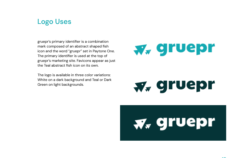
The final logo depicts a pair of abstract sharp-pointed fish. The fish motif represents teamwork and collaboration, and the difference in size empathizes the gruepr embodiment of diversity and how it contributes to team formation.

Hi-Fis
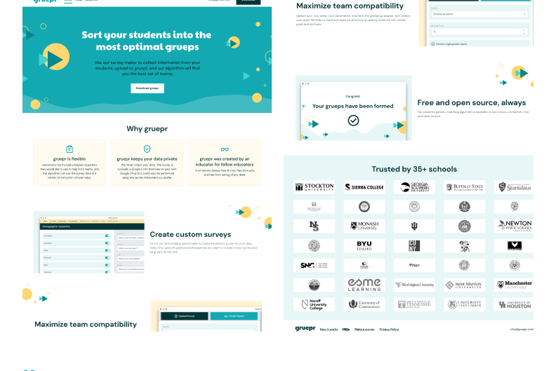
Our final step was to use our new branding guide to translate our wireframes into high fidelity mockups. The hi-fis served to represent a realistic depiction of what the final marketing site and desktop app would look like. We embarked on weekly design sprints, dedicating each week to a different aspect of the experience. We completely redid the marketing site by incorporating our new design elements to improve visual appeal and better communicate the value proposition of gruepr. For the desktop app, we rearranged the make survey and form teams experiences into smaller sections and also incorporated our brand color and illustrative elements.
Marketing Site
Desktop App
Brandbook
After creating our hi-fis, we ended our project with client handoff. Our final task was to create a brand book to summarize the brand identity we created which included typography and type hierarchy, color palettes, illustrative elements, and finalized hi-fis. This book consolidates branding guidelines so that the client can continually reference back to it when iterating and improving his website further.


